 We’re delighted to have guest contributor Scott Sanders, senior consultant at Simon-Kucher & Partners, share his expertise with CPG Data Tip Sheet readers. Scott’s contact details can be found at the end of this article.
Of the four Ps of marketing, price has the most power to transform a company’s revenue and profit. The best way to kickstart a pricing discussion is to visually display price analytics.
Ultimately, these visual tools support portfolio and channel strategy development. Importantly, they help take emotion out of pricing decisions and focus strategic discussions on the heart of the matter.
Among others, these are three powerful tools to visualize prices:
- Price Waterfall
- Candlesticks
- Discount Curve
Each tool demonstrates a range of insights that can drive strategic thinking.
1. Price Waterfall
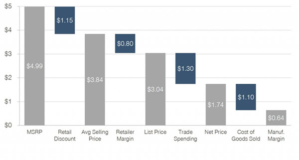
The price waterfall shows us where we might have problems with profit leakage. Though the chart is simple, it can be shockingly difficult to calculate some of the costs, especially trade costs, and translate them to costs for an average unit.
 Example of an interpretation: Above, much of the manufacturer’s profit is eaten up by discounts, shown as trade spending, which is used here largely to allow the retailer to discount from MSRP (manufacturer’s suggested retail price) to its ASP (average selling price).
The full amount of trade spending isn’t reflected in that discount amount, and we might suggest reducing the amount of trade spending or re-negotiating with the retailer to reflect more of the discount in the price it charges on-shelf.
2. Candlesticks
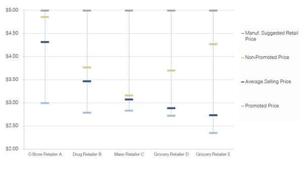
Candlesticks help us visualize the spread between the different types of prices seen in retail outlets — spanning from MSRP to the promoted price.

Example of an interpretation: You might imagine that the manufacturer wants to move its average price at its Mass channel customer closer to $3.50 but they refuse to do so.
Looking at the candlesticks, we might see some great reasons why: Their Grocery channel competitors are regularly undercutting this Mass retailer, selling as low as $2.39 on promotion and $2.75 on average. Why would the Mass channel customer want to be undercut even more? You could understand their point of view.
We can also see that there is poor price discipline. This company has a suggested price that it rarely, if ever, earns from its consumers. This will lead to high rates of trade spending that might not be necessary.
3. Discount curve
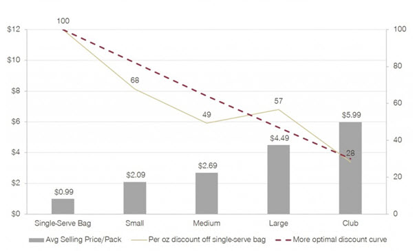
How much do consumers pay on an equivalized basis? Typically, we would look at price per pound, ounce, gallon, dozen, or some other volume measure, for all the items across a portfolio.
 We ideally see that consumers receive a consistent value across sizes in the portfolio, with a discount as the volume in each package increases. We would want to see a smooth (or, at least, smooth-ish) line sloping from the high index to the low index.
Example of an interpretation: We can view this two ways. One, the Large package is too expensive on a per-ounce basis, and it should cost less. Or, two, Small, Medium, and Club size packages should be priced to reflect the value that consumers see in the Family Size package.
There is no one right answer, but the goal is to remove kinks in the discount curve. An optimal curve would be relatively smooth, without upward or downward kinks.
—————————————
Visualizing prices is an important step as part of strategy work. But in most companies, prices sit on a list for price quotes and internal reference. It’s hard to get visibility into what’s happening in the real world.
Freeing pricing information from that piece of paper transforms it into living analysis that drives strategic decisions.
About the Author
Scott Sanders is a senior consultant at Simon-Kucher & Partners, where he specializes in the consumer packaged goods (CPG) and retail industries covering strategic topics including price, promotion, assortment, and branding. He previously co-owned Bosco Chocolate Syrup, his family’s business, and held several roles in CPG sales agencies. He can be reached via LinkedIn.

This might seem kind of dumb, but how do you make candlestick charts like that? Excel doesn’t seem to want to let me do it…
Chris, Good question – I don’t know how to do them either! I’ve reached out to Scott to get some more details on how to make the candlestick charts. Thanks, Sally
Aloha,
I believe the chart type within Excel and PowerPoint is called a “Stock” chart (aka Candlestick). There are several “how to” webpages and videos out there… here’s one: http://www.officetooltips.com/excel/tips/creating_a_candlestick_stock_chart.html
Thanks the for the link, Bob! Yes – I think the “candlestick” is a variation of a “stock” chart, which has actually been around for a long time but typically used in financial applications.
Hi, this is a great visualization. Appreciate the content. Robin and Sally, you guys are doing a great job with assimilating these knowledge hacks that are extremely essential for newbies to the experts as well. I have been waiting for the next post eagerly.
I had a quick question, if anyone could help me with. I have been asked to see the price per kilo for a XYZ category; was told that the XYZ category’s price per kilo is acting irregular compared to ABC category, another category within the same industry (in a particular market). I see that the absolute price points (per kilo) are different, but the growth rate is aligned. Even if its not aligned i would have assumed they have different dynamics; so could act differently. I checked the category’s price point (and the growth rate for MAT for past 3 years) and they all look to be going their own way. Couldn’t build up exactly on how I should move ahead with analyzing the data to answer the question : “we assume that the XYZ category price per kilo is acting weird; compared to ABC in DEF region. That isnt the case in other regions. Is this because the competitors in the XYZ category are doing something (like changing price) for share attainment?”
Any articles, links, case studies or any thing that may help me build thinking towards analyzing pricing is most welcome.. Thank you
Diwash,
Robin has written quite a lot of articles about pricing. You might take a look at those if you haven’t already. This one, which is about price per volume (like your price per kilo) might be particularly relevant:
Price per What
I would start by directly investigating the theory raised in the question: Have shelf prices (in other words, look at unit prices, not price per kilo) changed at the individual item level? If they haven’t, then the category price per volume must be due to some type of sales mix change (mix of sizes, mix of brands). It can certainly be the case that an average category price moves around even though no shelf prices have changed for any product.
Thanks for sharing, we’re always looking at new approaches for data visualization in market research. We make it a standard for our reports to pass the “eye test.” Data can be stale so as an industry we need to make our reports visually appealing enough that people want to dig deeper. Enjoyed reading this and seeing some new examples.
– George
Let me say this that the world is waiting for the next post 🙂 You shouldn’t stop blogging. It’s been too long. I check this blog twice per week, at least.
Thanks for the positive feedback! We promise to keep posting but won’t make any promises on how often. 🙂 Writing a good clear blog post is harder than you would think but we get a lot of satisfaction from helping our fellow analysts navigate the stormy seas of Syndicated CPG Data.