Recently, I wrote about a Nielsen chart illustrating consumer behavior in the U.S. during the COVID-19 pandemic. In this post, I’ll show these same metrics from another panel provider: Numerator. Numerator (formerly known as InfoScout) gathers their panel data by having panelists take photos of physical receipts and provide access to their e-receipts. That’s a very different methodology from Nielsen’s approach.
Nielsen’s panelists scan the bar codes on products they purchase and indicate where they bought it. Many CPG companies continue to use Nielsen’s panel or get comparable information from IRI. But Numerator has gained traction in the industry because their panel is much broader, both in size and channel coverage.
So how do the two sources compare in their assessment of shopper trends during this crazy time?
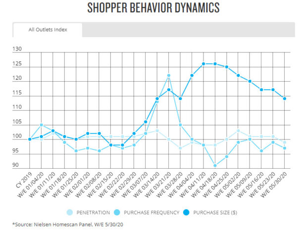
As a reminder, here’s the latest version of the Nielsen chart I wrote about in my earlier post. Refer back to that post if you want my full explanation of the metrics Nielsen used.

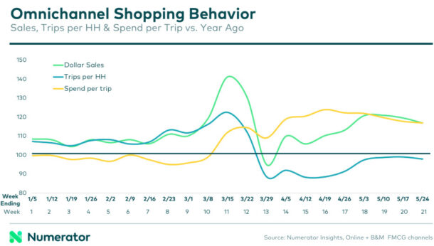
And here’s the comparable chart from Numerator.

Does Numerator’s chart provide the same information as Nielsen’s? Very similar.
- How many shoppers did you have? Nielsen included this metric in their chart but Numerator did not, presumably because there were no interesting changes at the all-outlet level (you’ve got to buy stuff somewhere, right?). Numerator did share the number of shoppers stats in a table, which I’ll discuss down below. The third line (green one) on the Numerator chart is total sales.
- How often did they buy? In their chart, Numerator calls this “trips per HH”. HH means household. Trips per household (Numerator) = purchase frequency (Nielsen).
- How big was their purchase? In this chart, Numerator calls this “spend per trip”. Spend per trip (Numerator) = purchase size (Nielsen). Another common name for the same metric is “basket size”.
Both companies are indexing current values to year-ago with a slight difference. Nielsen indexes each week to all of calendar 2019 (in other words, current week over average week year ago). Numerator provides a straight year-ago comparison (in other words, current week over same week year ago).
Nielsen has one additional week available so props to them for speed.
Do you draw the same conclusions from the two charts? Yes, the two panel suppliers agree on the dynamics and magnitudes of the behavior changes: Trips peaked in mid-March as everyone rushed to stock up on essentials. Trips then dropped modestly below year-ago levels and basket size rose as all activities moved into the home. Basket size peaked in mid-April and then declined but remains 15-20% above last year. Trips per household has returned nearly to normal.
Who has the better chart? IMO, it’s Numerator. Numerator’s chart is more intuitive and easier to read with a simplified x-axis and strong contrasting colors. Nielsen’s gridlines are visually distracting. The gridlines do make it easier to guesstimate the actual numbers. But Numerator provides the numbers in detailed tables below this first chart.
Who has the better panel? If I were buying panel data, I would definitely want to talk to both suppliers and understand their strengths and weaknesses vis a vis my particular business issues. Both suppliers have been chosen by leading CPG companies. Personally, I don’t have enough experience with Numerator to make a blanket statement on which panel is “better”. But my colleague Paul Hunter wrote a guest post for us a couple of years ago, covering the newer panel suppliers, and he has a strong opinion.
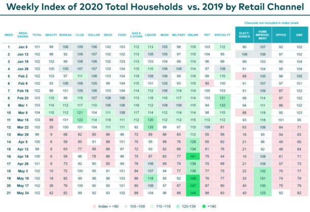
Now, let’s go back to the “how many shoppers did you have?” question. I mentioned above that Numerator supplied that information in a table. Here is that table, showing number of shoppers versus year-ago by channel.

Again, these numbers are indices. Green highlighted cells are values above 110 (meaning number of shoppers increased by more than 10% versus year -ago). Red highlighted cells are below 90 (meaning number of shoppers declined by more than -10% versus year-ago).
The first data column (after week and week ending), labeled Total, shows the same flat overall penetration that Nielsen illustrated. This chart also illustrates quite clearly that some people have switched at least some of their shopping online. In April, pretty much every channel got < 90% of last year’s shoppers while online was 30-40% higher than last year. Online penetration was already growing (around 15% above last year) but escalated dramatically in April and has stayed high. You can see this table live plus detail for the other measures on Numerator’s COVID 19 page.
This chart illustrates one of the advantages of panel data: it can illuminate behavior across all retail channels. With POS/store data, you must get the retailers to cooperate and some just won’t. Plus it can be cost-prohibitive to gather and process data from so many different retailer systems, some more sophisticated than others. Panel data solves that problem by going straight to the shopper.
Panel data has different data problems (getting big enough samples of representative shoppers and making sure you are getting them to share all their purchases) but it’s theoretically possible to get information for every type of retailer (even the ones that don’t want to share their data).
Thanks to both Nielsen and Numerator for providing so much fantastic information to the public!
If you want to know more about panel data, check out all our panel data articles. Have specific questions about panel data? Let us know in the comments below and we’ll be happy to help.

Leave a Reply