 In a recent post, I illustrated the most common usage of Total Points of Distribution (TDP) – as a substitute for % ACV in velocity calculations.
In this post, I’ll share another one of my favorite ways to leverage the TDP data metric, which is explaining sales trends. If you aren’t familiar with TDP, read this intro post before continuing with this example.
“Dollars,” “dollar share,” and “dollar trends” are probably the three most common measures examined with syndicated data. This isn’t surprising as they all measure one piece of the bottom line for retailers.
But when we look at these measures, it doesn’t take long for the “why’s” to start flying. Sometimes you won’t find the answers in syndicated data. But sometimes you will. So, where do you look first?
When I want to get a handle on what’s driving sales, I always start by looking at trends in the basic components of dollar sales: units, price, and distribution. This step never hurts and usually helps. And since this type of big-picture analysis is usually done at the brand, product group, segment or category level (where lots of different items are involved), I generally use TDP for the “distribution” measure.
Why do I use TDP instead of % ACV for this? % ACV is usually high and stable for large groups of products or widely available brands. It simply won’t tell us much. This is because only one product in a group needs to scan once during the period to get credit for % ACV distribution. That’s a low bar at the category level. Therefore, % ACV can mask substantive and dramatic changes in the mix of products distributed within the group.
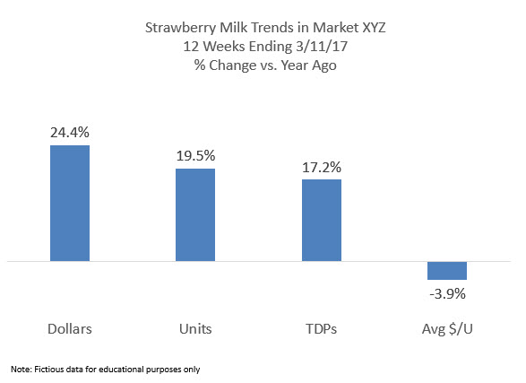
For example, here’s how this simple analysis might look for segments in the (fictional) flavored milk category:

We can see that Strawberry Milk has grown in both dollars and units. TDPs are up significantly and price is down modestly. So both factors are moving in a direction that should boost sales (i.e. price down, distribution up). However, distribution is likely the stronger influence given the magnitude of the change. Therefore, I would focus my analysis on distribution first and then take a closer look at price.
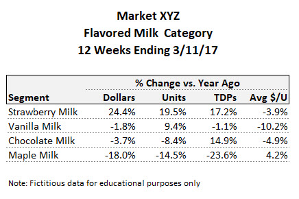
Now let’s add in more segments:

How do we interpret these numbers? Let’s take a closer look at each segment.
Strawberry Milk
Strawberry Milk looks like a big winner. But it may be all distribution driven. And that distribution may or may not be justified given the segment’s sales rate. As one of my clients likes to say “If you stick a bag of dog poop on the shelf at Walmart, it’ll move.” If Strawberry Milk is your segment, you might be tempted to declare victory, but I would suggest taking a closer look so you can anticipate what might happen now that the new distribution is in place.
Maple Milk
Maple Milk is way down. But we see distribution has declined dramatically as well. Maybe distribution is down because Maple Milk moved so poorly so retailers discontinued some skus. But maybe it’s down because of the distribution losses. This is a common chicken and egg scenario.
Maybe a segment isn’t performing well, so a few items get discontinued. This, in turn, further accelerates the decline and the segment looks worse than ever. Therefore, it’s important to look at how the remaining items are moving. Maybe they’re all very strong players. If so, you want to point that out to the retailer before the distribution driven volume performance further undermines the segment.
Vanilla Milk
The Vanilla Milk trends are either price or mix driven. Average $/unit is down significantly, leading to a gain in units. But dollars haven’t grown. To understand what’s going on, you have to dig down to the item level—segment level is just too broad. After all, average $/unit can change even if the shelf price doesn’t move. (For more on this, check out this post and this one from Robin Simon’s series on price.)
The bottom line for Vanilla Milk: start your analysis by investigating price for this segment. Distribution looks pretty stable.
Chocolate Milk
Chocolate Milk is the segment where “why’s” are least likely to be answered by syndicated data. Dollars and units are both down despite increased distribution and lower average $/unit. You might find some clues by analyzing lower levels in the product hierarchy (e.g. brand, promoted product group, sub-type). But it’s also possible there’s something going on with consumer demand or a change in marketing. All these trends are counter intuitive and point to a “something else” driver.
Sales Trend Analysis Summary
That’s a quick overview of my thought process for the first step in this analysis. To summarize, if I saw big changes in price and stable distribution, I’d focus my analysis on price. And if I saw big changes in distribution and stable price, then I’d focus on distribution.
The next step is to dig further into the hypotheses I formed. It’s easy to get overwhelmed or run down rabbit holes. By formulating some guiding hypotheses first, you can focus your efforts most efficiently.
This approach is also great for illustrating big picture trends in presentations to retailers. If I’ve found that distribution changes are the key to understanding volume gains (or losses), a chart like the one above can be a great way to kick off your presentation and lead to more detailed findings.
For a more advanced lesson on volume drivers, check out this series of posts where Robin walks you through her step by step approach to decomposing volume trends.
Did you find this article useful? Subscribe to CPG Data Tip Sheet to get future posts delivered to your email in-box. We publish articles about once a month. We will not share your email address with anyone.

Do you or have you ever thought about producing templates where we could work on some of the items that you demonstrate?
I don’t currently have templates but that’s an interesting idea. For this article, what type of template would be useful to you? In other words, what would you like to be able to do with the template and what would it include?