 We analysts love nothing better than digging through piles of data. But, when it comes to communicating our insights, less is more.
Note: In this article, I focus on charts in the form of slides but many of my design recommendations would also apply to dashboards or more complex visualizations.
To increase the odds of colleagues or customers remembering and following your recommendations, you need to keep graphs and any accompanying text simple and clear. I’ve developed three rules for creating persuasive charts:
- Limit each chart to one key point. Remove any data that doesn’t relate to that one point.
- Use high contrast colors and large font sizes for key pieces of information.
- Remove or de-emphasize all other graphic elements. That means no fancy effects, no background colors, no animations and no 3D!
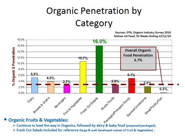
To illustrate, I’ll make over this slide I’ve pulled from my files:

This slide has great information. But it’s packed with visual distractions. That makes it hard to take in its message at a glance. And one glance might be all you’ll get!
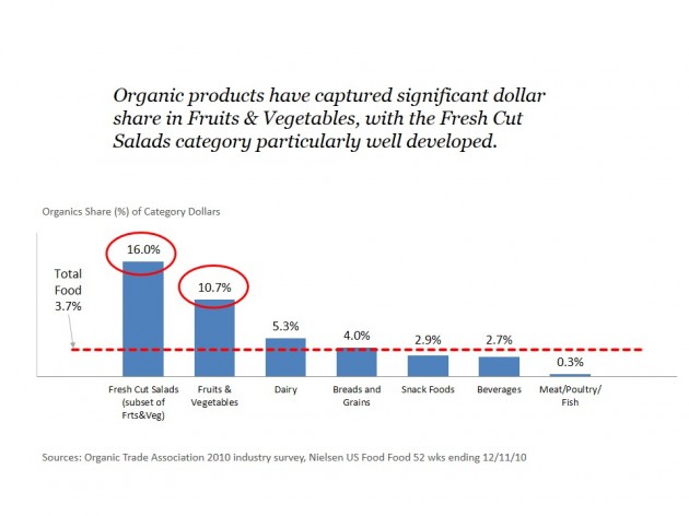
Below, I’ve made over the same slide using my three rules for creating persuasive charts:

And here’s how I did it, organized by rule:
1. Limit Each Chart to One Key Point
I started by including my key point in the title of the chart. Rather than “Organic Penetration by Category,” I changed it to “Organic products have captured significant dollar share in fruits and vegetables, with fresh cut salads category particularly well developed.” This title makes the conclusion clear.
I removed categories with repetitive data points. The original chart had nine categories; I’ve reduced it to seven. My chart still illustrates the range of results but requires less reading and has fewer distractions. If it’s important to include data points for all categories, put them in another chart or an appendix.
I also changed the order of categories. The order seemed entirely random before. Now categories are arranged by data value, from highest to lowest. I guess this is actually a fourth rule! Bars and lists should always be in some type of performance order.
One thing I didn’t remove was documentation of the data, such as source, time period and geography/market. All charts should include this information. It’s not enough to provide it only at the beginning of a presentation. It may seem repetitive to put it on every chart, but you never know a single chart will be pulled out of the presentation and become separated from this critical information.
2. Use High Contrast Colors and Large Font Size
I picked a higher contrast color for the dashed line showing the average results. This line conveys valuable information and deserves more emphasis than in the original chart.
The font sizes were good in the original chart. However, I did opt to reduce the font size on the bar labels so I could change them from slanted to horizontal alignment. Horizontally aligned text is easier to read than slanted and worth a slightly reduction in font size.
3. Remove or Deemphasize All Other Graphical Elements
I changed all bar colors to blue. This is less visually overwhelming, and no information is lost.
I removed the gridlines. Gridlines tend to be overused. They’re often visually distracting and serve no real purpose. When I do use them, I make them a very light gray.
I removed the y-axis labels. Data values are displayed above each bar, so the y-axis labels add nothing except, again, potential visual distraction.
Another change I made (unrelated to my three rules) was to remove the word “penetration” from the chart. “Penetration” has a specific meaning in the context of syndicated data: % of Households Buying. That’s not what’s meant here. How do I know? If this was % of Household Buying, the overall food value would not be lower than some of the categories. Instead, I think this chart is showing what % of each category is contributed by organic items. And it’s probably based in dollars since that’s the typical cross-category measurement. So in my y-axis title, “Organics Share (%) of Category Dollars,” I make clear the data measure used. And instead of “penetration”, I use the word “share” in my title.
My three rules for convincing charts are simple but not always easy to follow. You need to consciously step back from your chart and ask, “What data or design elements can I take away while still making my point?” The more you strip out, the clearer your point.
If you’re interested in this topic, dashboard design and visualization expert Stephen Few is a great resource. His book, Show Me the Numbers: Designing Tables and Graphs to Enlighten, is a classic.
Bonus content:
Another design-oriented visualization guru is Edward Tufte. He has many books and also teaches a one-day course, which I had the pleasure of attending here in Boston. I wanted to share some of the thought provoking comments he made in that course. Only read on if you like this topic and want to ruminate!
Tufte would disagree with my one-point per slide approach. He dislikes PowerPoint because it stacks information and has a slow reveal. He prefers reports and dashboards which convey a lot at once. We analysts need to think about our goal for the information. I still stand by my one-point per slide rule for situations where I’m looking to make a convincing argument.
Tufte is a big fan of web-based dashboards for conveying information. He likes them because the data is physically adjacent in space – not stacked in a slide deck. He believes in giving people a lot to look at and then they can choose if and when to drill down – that is real personalization in his opinion. He believes the problem with slide decks and drilling down is that it’s hard to make comparisons once we leave some of the data behind.
I worry about dashboards because I think they can overwhelm and keep the audience from noticing what’s most important or relevant. But Tufte claims “information overload is a failure of design”.
My favorite statement from Tufte: “The usual advice is ‘know your audience’. I say instead ‘know your content’. Your competitive advantage is the content. You don’t need to know your audience but you do need to respect them.”
Did you like this article? Subscribe to CPG Data Tip Sheet to get future posts delivered to your email in-box. We won’t share your email address with anyone.
This is an updated version of a previously published article. It has been modified to include additional content.

Love this, it’s a lost art! My favorite chart in CPG? The classic “bump chart” of weekly volume with price overlay. So many $ driving applications.
Mark, You are so right about the bump chart! There is nothing better for helping you figure out what the heck is going on or at least developing some good hypotheses.
This is spot on Sally. I’ve lost count the number of times a presenter has moved on to the next chart only to introduce it with “Now you’ll notice this is a very busy chart and you’re not going to be able to see all of the numbers, but….” The chart is there to illustrate the point being made by the presenter.
One picky comment on your revised graph. I would have also eliminated the two borders surrounding the chart as they add no value. Love the rest.
Great! I try to follow these rules as well, and I think my presentations have become a lot more effective because of it. In regards to PowerPoint vs. Dashboards, I think they serve a very different purpose. I create dashboards for our internal teams to be able to do some self-serve analytics – but even then, people who aren’t data people can find it overwhelming. I use these dashboard style reports a lot for myself and pull from these to put together PowerPoint presentations for our sales team (or sometimes do share just one graph internally to make a point!). We can’t go into a meeting with a buyer with a digital dashboard in hand, and a lot of times meeting rooms have no tech hookups, so it’s just old fashioned paper presentations. I have some high level “trend” slides that are more dashboard style, but on the whole I agree — the most impactful slides tend to be the ones that make a single point bold and clear.Cluttered slides packed with irrelevant or unimportant information are a waste of everyone’s time.