
One of the most powerful graphs is the line chart. Line charts allow you to:
- Decode underlying trends over time
- Compare trends for different products or markets
- Explore relationships between different measures
In addition to making it easier to see trends, you will typically use a line graph because there’s just too much data to see any insights by looking at a table of lots of weeks or months. This is part of a series of posts on using graphs to make your analysis come alive. Learn about the pie chart, the related stacked bar chart and the always popular bar chart in previous posts.
1) Understand The Real Trend
We are all used to seeing data reported for time periods that aggregate several weeks or months together, along with how things have changed vs. another period, usually that same period a year ago. In this example, we see that unit sales of DeeLicious Donuts are up +13.3% in 2013 over 2012.
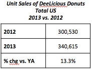
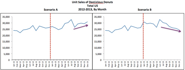
Look at the following two charts. Both result in the same overall results shown above: 300,530 units sold in 2012, 340,615 units sold in 2013 and a 13.3% change vs. year ago. But in Scenario A, sales started to increase in the last few months of 2013 while in Scenario B sales have been declining for several months. Even though these two different monthly scenarios result in the same annual results for 2013 you can see why it is also important to look at the trend over time. You may want to do something different from a marketing perspective if your sales are increasing as opposed to decreasing.
2) Compare Different Products
Sometimes you want to see how different products are trending relative to each other, like this:
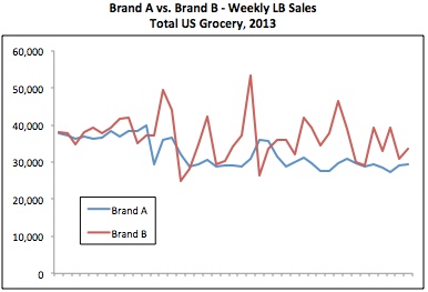
Looking at this, you can see that Brand B seems to have more promotions than Brand A after the first part of the year, as there are more weekly spikes in sales.
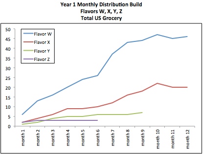
Another common thing to look at with line charts is the progress of a new product introduction. The chart below compares the distribution of 4 different new products introduced by the same brand at different times. The periods have been aligned so that you can see how fast the newest introductions (Flavors Y and Z) are building distribution compared to two other products that were introduced more than a year ago. For some reason, the newest flavors are NOT getting the distribution that previous introductions have had. Time to talk to Sales and find out what’s going on here…
3) See The Relationship
We intuitively know that if your product is in higher distribution, then you will likely sell more product. But how strong is that relationship? A line graph lets you easily see that as distribution increases, sales go up.
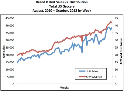
Note that when you are putting two measures with very different values on the same graph (like sales that are in the thousands and distribution which ranges between 0 and 100), you will need to put one of the measures on the secondary y-axis. When I first created the chart, it looked like this:
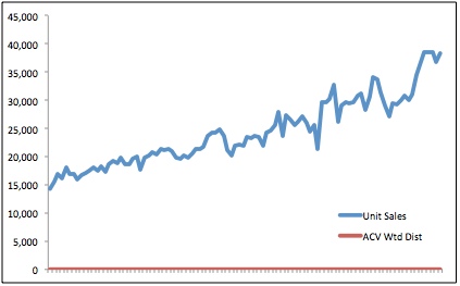
In order to make the graph easier to read I moved the line for Distribution to the secondary vertical (or y-) axis, which appears on the right and added titles to both vertical axes and to the x-axis.
Did you find this article useful? Subscribe to CPG Data Tip Sheet to get future posts delivered to your email in-box. We publish articles once a month. We will not share your email address with anyone.
